Optimized device security, quick results
Scanning made easy
Our smart scan feature wasn’t benefiting our business goals and lacked a holistic process for checking customers’ device threats and vulnerabilities. I redesigned it into a usable, multi-layered diagnostic tool that boosted feature completion rate.
Let’s take a look at the process
The challenge we faced
Our product team came back with concerning numbers that we wanted to fix quickly. These included an excessive 9-minute scan, a click through rate sitting below 0.8%, and 20% user abandonment during scan process.
My role during this project
I was assigned to make a quick turnaround with a full system scan audit, redesign, and 0 to 1 full launch with our new UI system.
Role Lead Product Designer
Domain Security, Device Protection
Scope Global, Desktop Users
What the existing product looked like
The existing system scan screens were confusing. To start, they had two separate scans a user could run. Why? The other concern was the lack of user communication during the scan process. They were told sit back and wait - but for how long?
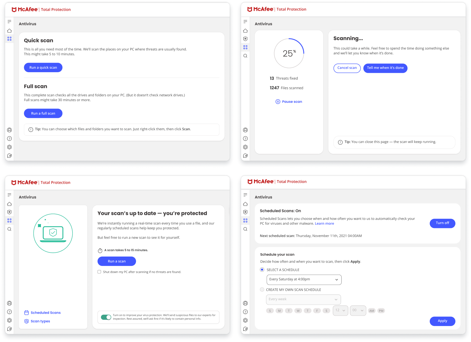
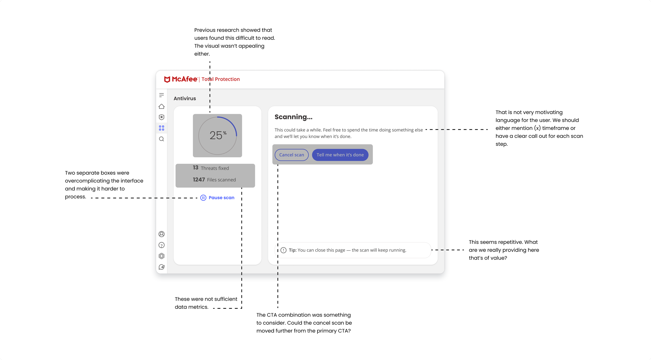
Auditing the scan page
I evaluated our existing system scan flows and identified the main scan screen as our highest-priority focal point. This foundational audit helped pinpoint what was working and where a design overhaul was urgently needed.
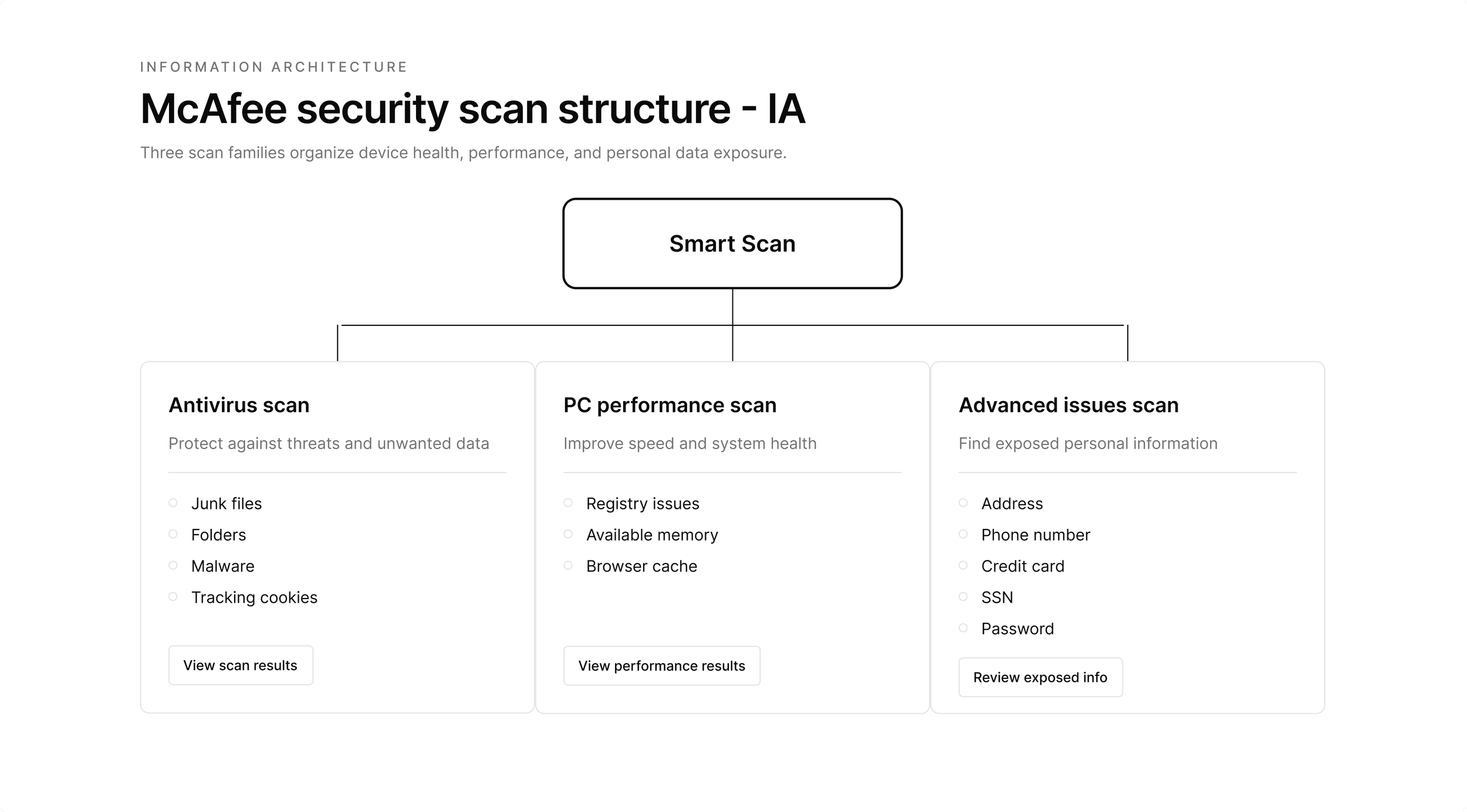
Creating the information architecture
Following the audit, I mapped out an organized structure of all scan categories. This information architecture (IA) served as the foundational framework for every subsequent wireframe.
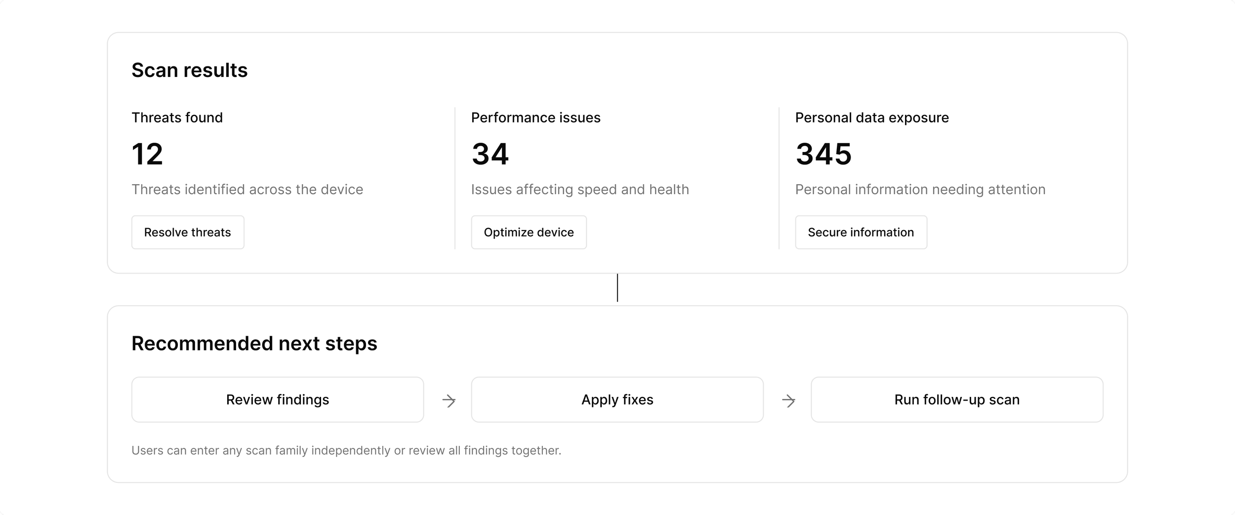
Exploring different designs and iterations
Leveraging the new IA framework, I created several low-fidelity wireframes to explore design variations. I tested these concepts via an unmoderated study with a sample user group to rapidly gather iterative feedback
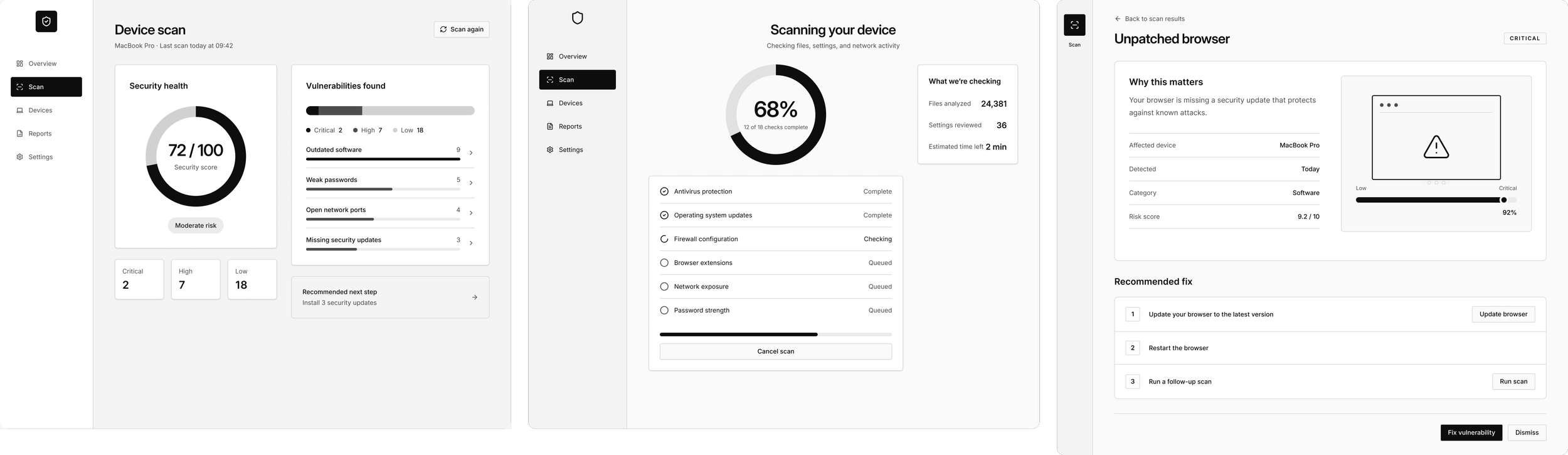
Taking in user feedback mid design
In collaboration with our research team, I launched an unmoderated study and questionnaire targeting 10 new product users. The resulting insights highlighted critical areas for refinement, guiding my design optimizations:
6 of 10 users did not like the circle visualization
80% users found the real time status updates very insightful
90% users chose the last exploration (option 3) as their most user friendly
Improving the explorations with user feedback
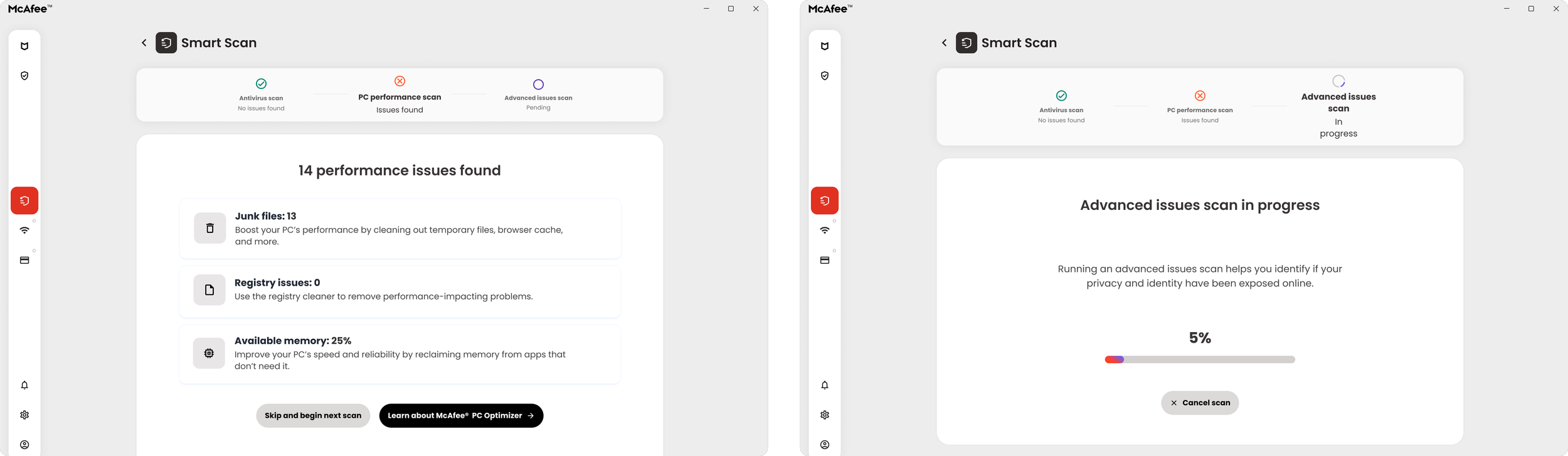
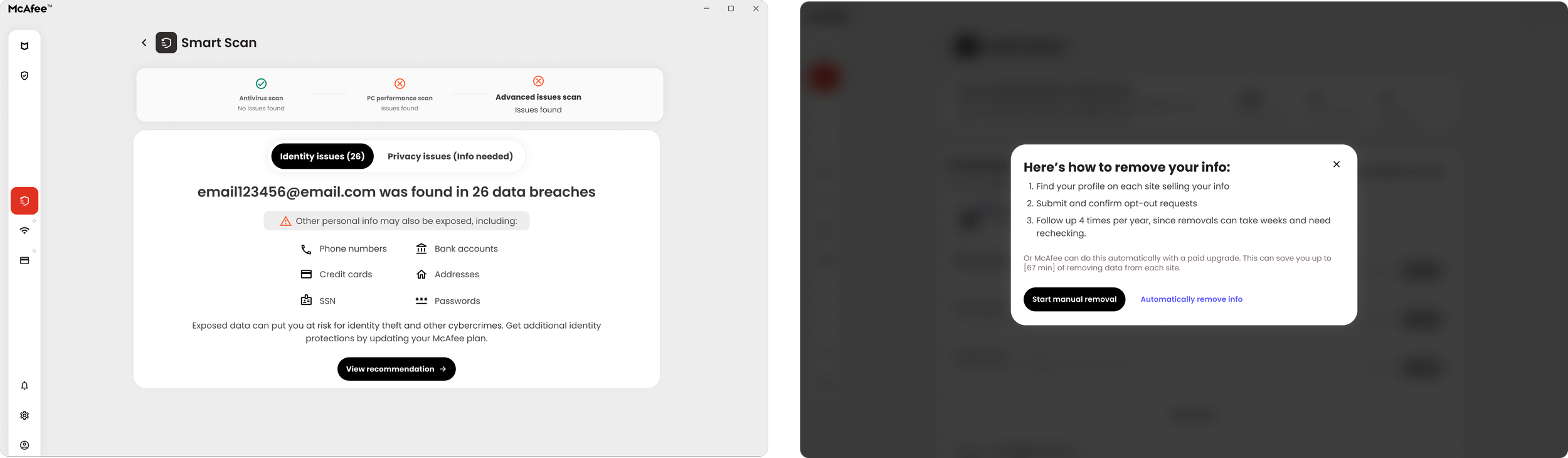
Using the most successful layout concept as my blueprint, I focused on three key pillars: introducing a delightful micro-interaction, crafting strong CTA language, and providing clear visibility into each stage of the system scan
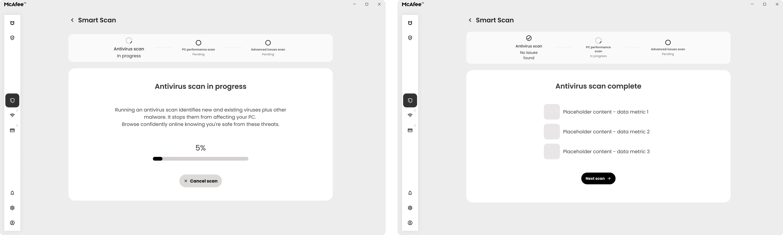
Next, completing the flow with high fidelity screens
Once the wireframes were finalized, I facilitated cross-functional reviews with content strategy and engineering. Together, we aligned on consistent copy standards and mapped out technical requirements, ensuring all API call states and error screens were accounted for. This was the final high fidelity flow:
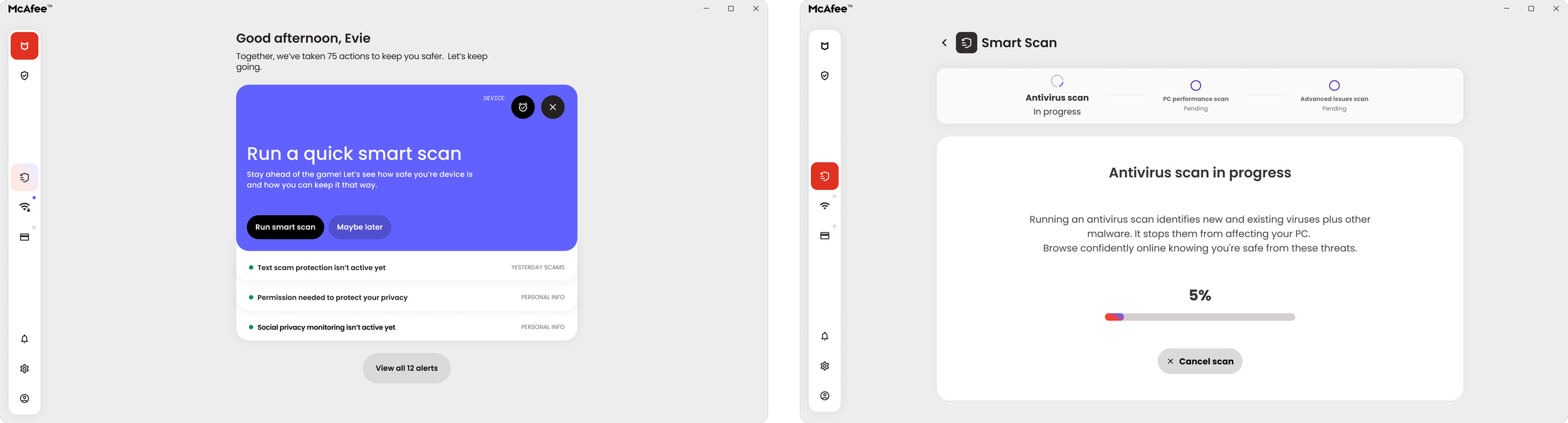
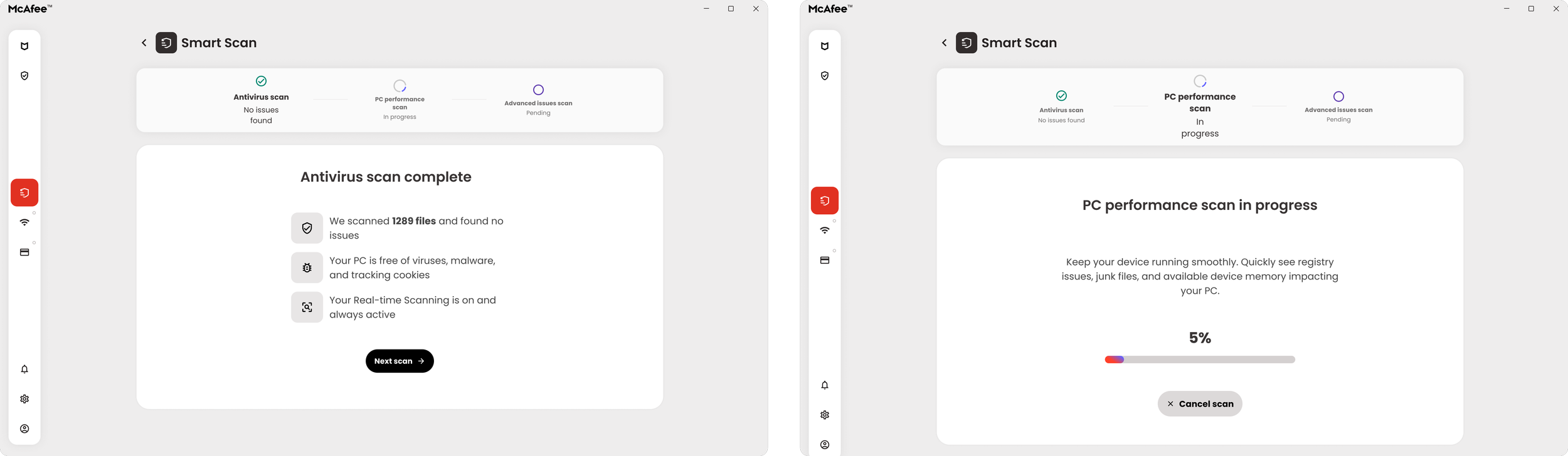
Roll out and impact
The system scan redesign successfully aligned with our core business goals and course-corrected key performance metrics. Rebranding it as smart scan enabled us to stand by our achievements, including an increase rate of manual scan initiations, reduced scan duration, and decrease in abandonment during the scan process.
1.7% CTR (up from 0.8%) for user initiated scans
15% decrease in abandonment rate mid scan
5 extra minutes removed from scan duration
Next Steps
Our next objective for this feature is driving post-launch enhancements. We will focus on delivering more comprehensive scan results alongside actionable remediation goals, such as the removal of personal information and harmful data.