The feature that boosted conversion rates
Instant Protection, Zero Hassle
Several designers took on this project, but struggled to find a workable solution. I took over the challenge and created a protection summary that increased conversions, app open rates, and feature enrollments.
Let’s take a look at the process
This is the mobile protection summary demo we delivered. It’s easy to locate within the new homepage, provides quick insights to users, and invites them to revisit our mobile app experience with 30 day real-time data updates.
The initial problem we were facing
Our product team flagged a significant drop-off in our core retention loop: while our mobile app maintained steady Monthly Active Users (MAU), our Daily Active Users (DAU/MAU) ratio hovered at just 15%, and only 8% of those active users successfully completed the feature enrollment funnel.
My Role Lead Designer
Target Audience Subscription Users, Mobile
The dominant business goal
Domain Security, Online protection
I was asked to go further than just the design metrics - our product team wanted the protection summary to entice users, increase engagement, and incentivize customers to stay with our business. In other words - build trust with our customers to drive higher app adoption. First launch to 1.3M subscribers, and target an MAU increase by 1-3%.
Audit of our existing value proposition
First I ran a quick moderate usability test with 10 existing users. The results showed a staggering 65% feature confusion rate. Next, I conducted a design audit of the existing homepages (below) to gather insights.
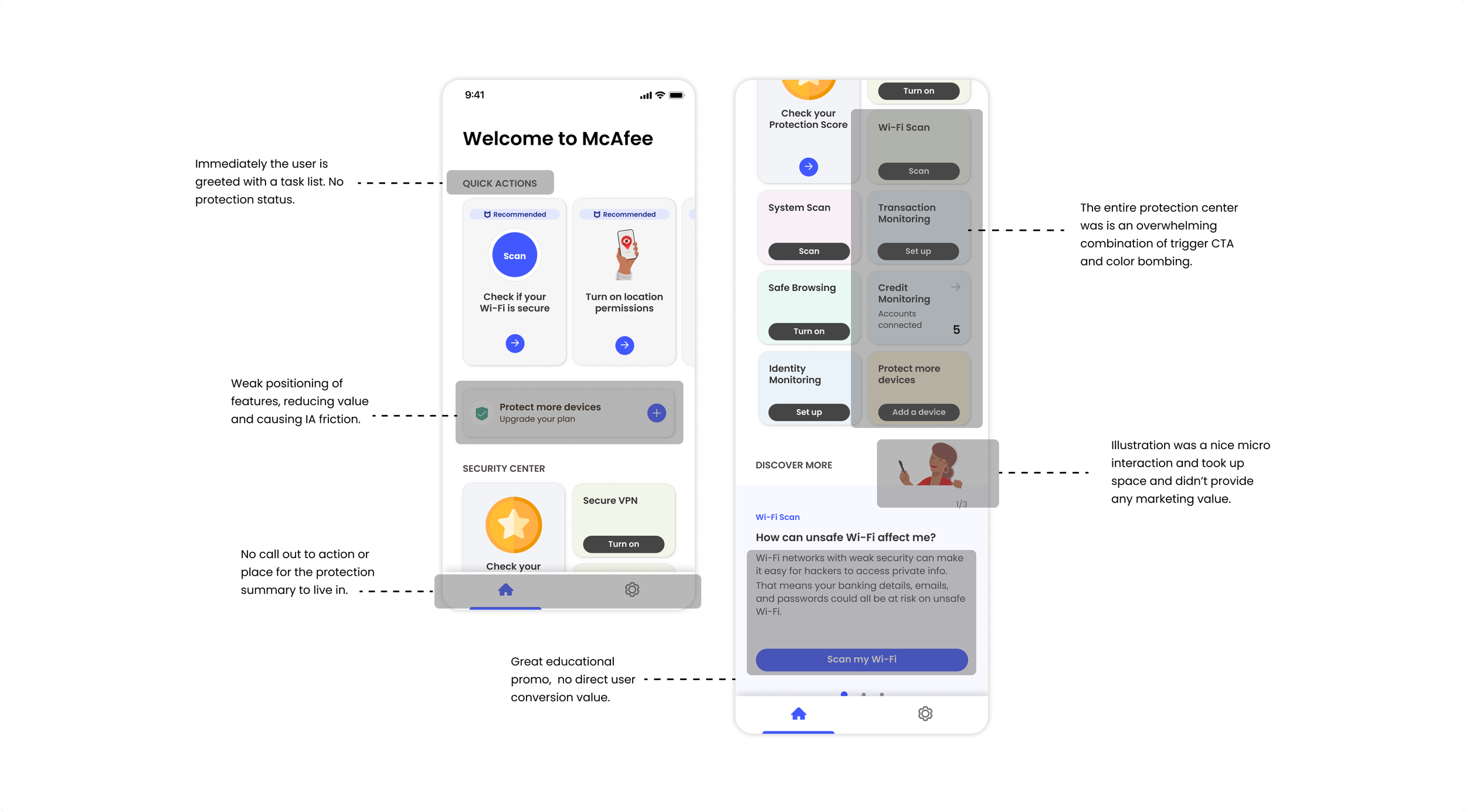
Positioning the Protection Summary strategically
Luckily, we were launching our homepage and complete UI library refresh at the time that I was working on this project. This meant that I would be able to advocate for placing the feature into our main entry points. A nice advantage.
I worked closely with the product lead to place us in key areas including the menu, main alert cards center, and device push notifications. Front and center.
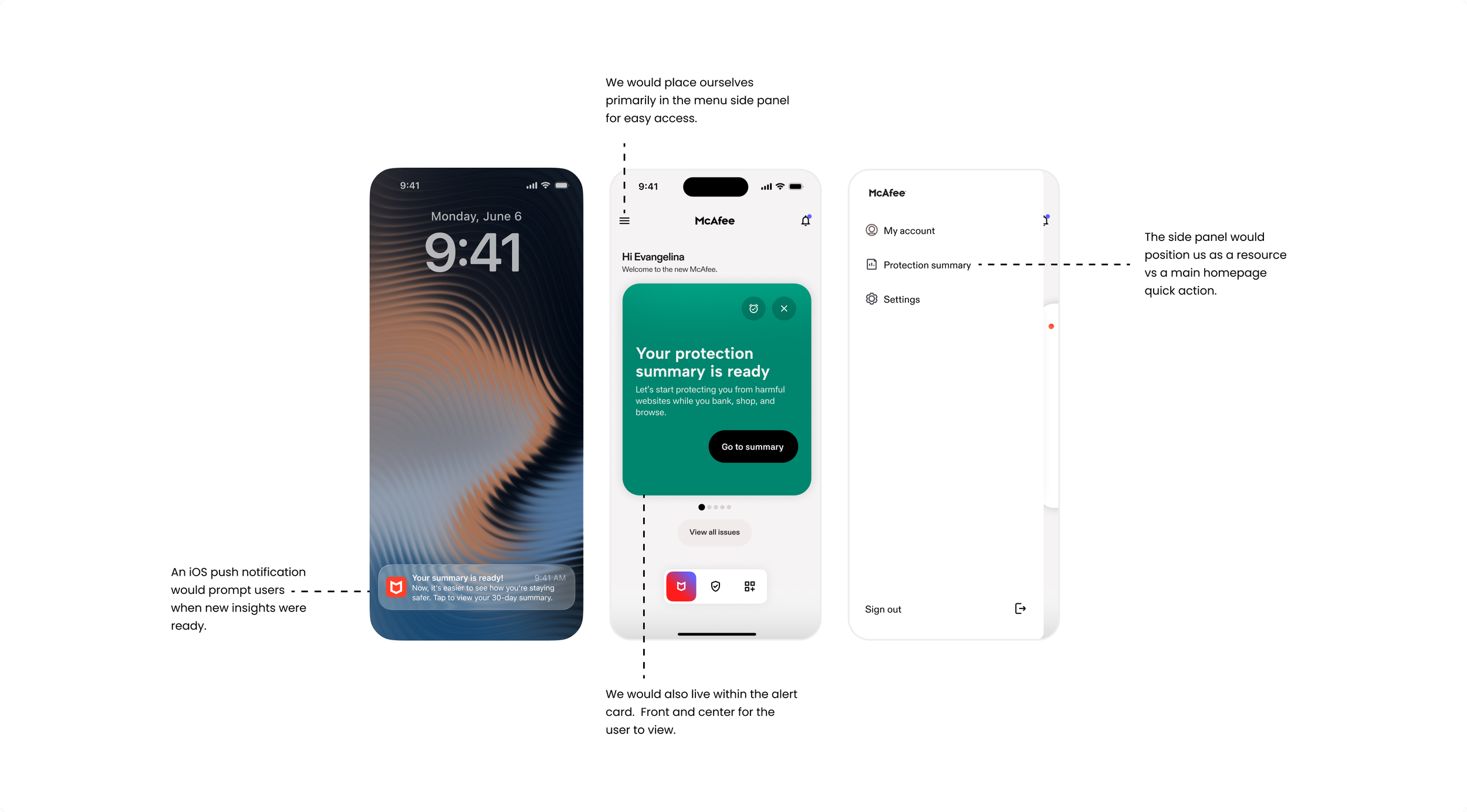
Creating user journeys to discover the ideal path
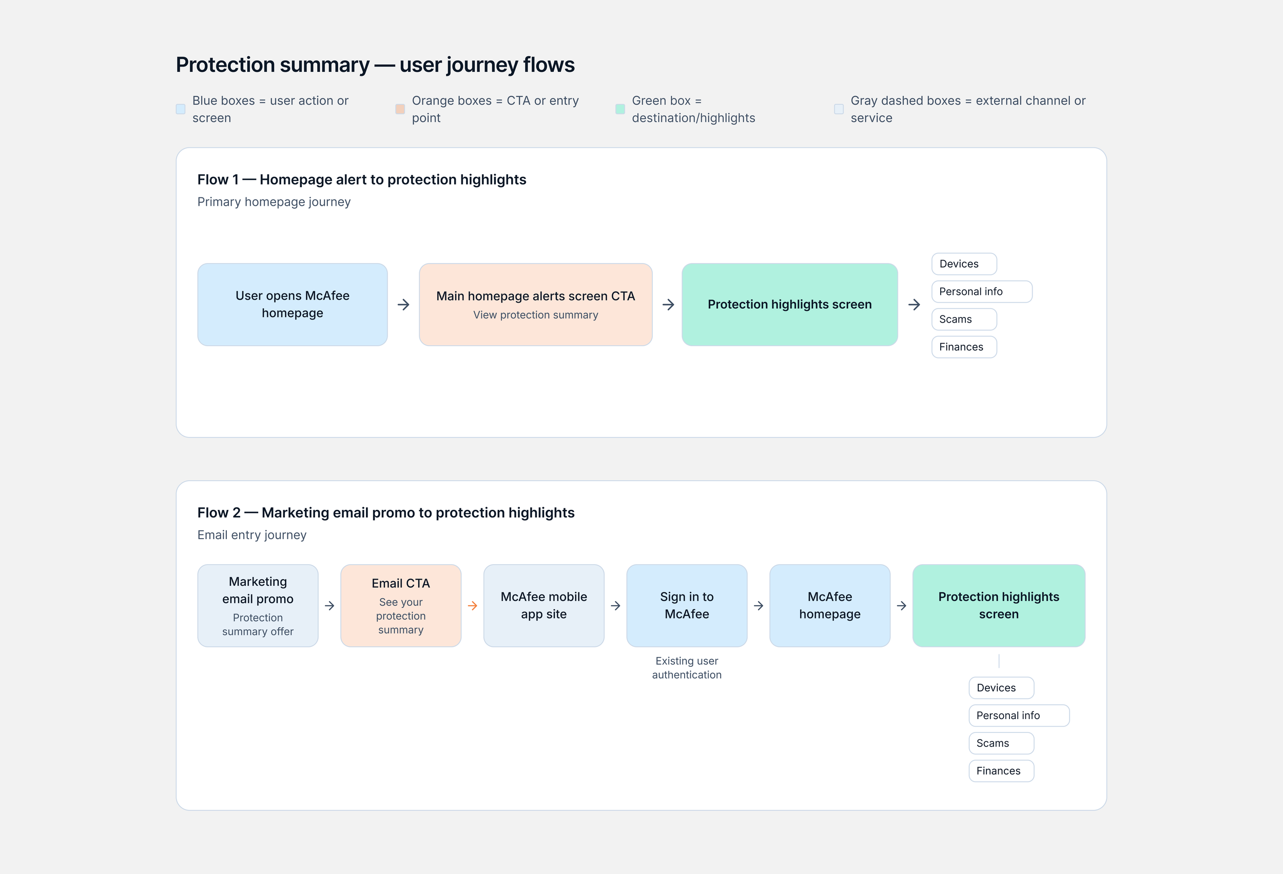
I mapped two distinct user flows: an organic entry via the homepage and a targeted entry through the marketing email CTA. Analyzing these pathways allowed me to identify the primary "happy path" and prioritize it as our core user journey to minimize funnel friction.
Iterating and wire framing potential layouts
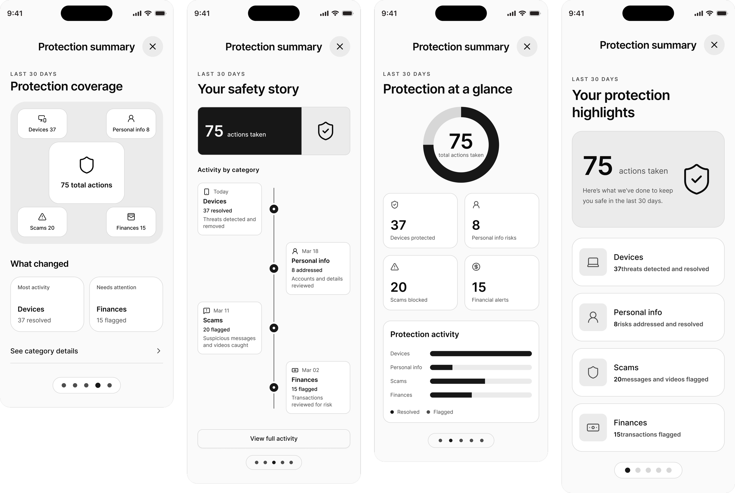
During the iteration phase, I leveraged competitive analysis and popular design patterns to map out our data-visualization strategy. I explored diverse UI patterns like timelines, bar graphs, and progressive disclosure to streamline the dashboard's information hierarchy.
Exploring further with data visualization concepts
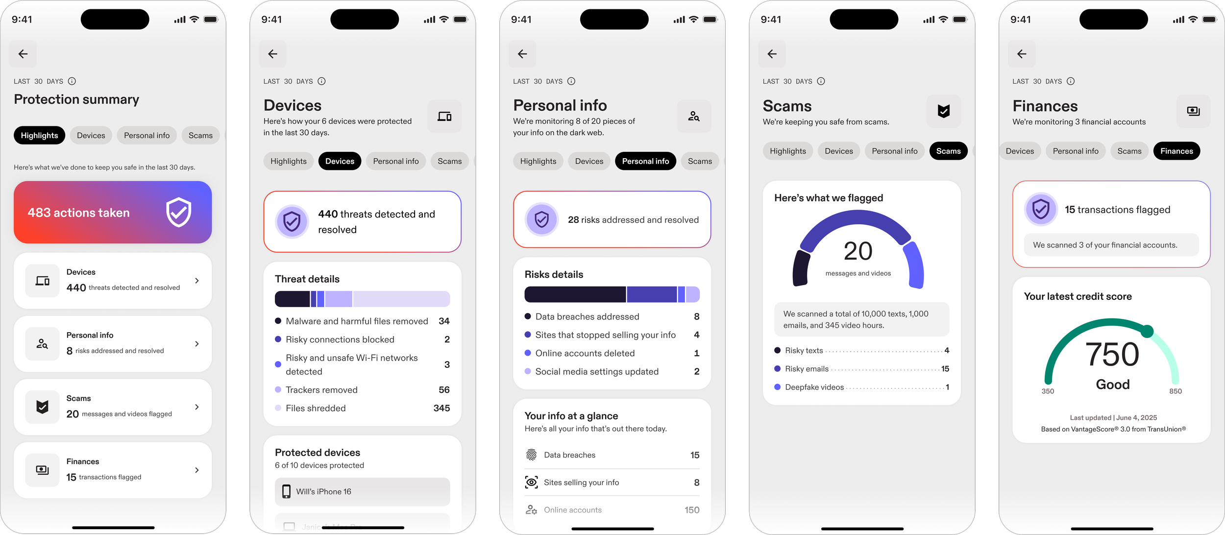
The Protection Summary feature would host four main protections: Devices, Personal Info, Scams, and Finances. For each category we would need to provide data metrics in a clear, quickly readable format. I iterated further with visualizations, but kept coming back to a more simplified concept - a bar graph.
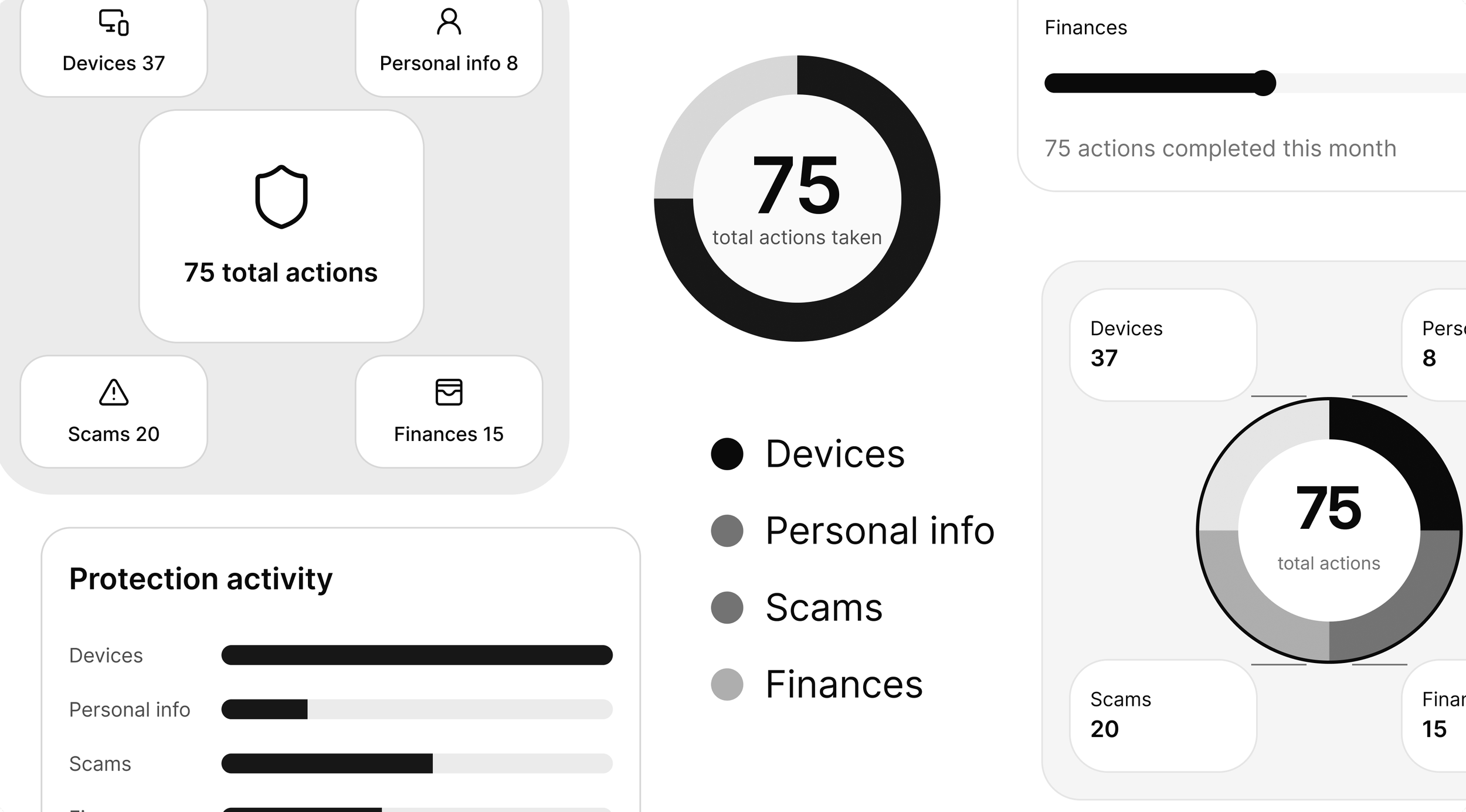
Gathering user feedback mid design process
At this point I had explored my options in terms of design, and I wanted to see if my hypothesis for utilizing a simplified visual pattern was true. Pressed for time, I ran a quick unmoderated survey with research to get user feedback on the wireframes. I was looking for comprehension, visual preference, and any other useful insights.
Findings showed that over 78% survey users actually found the visualizations too distracting. In this specific case, simple and structured seemed to win over user satisfaction. Some more insights below:
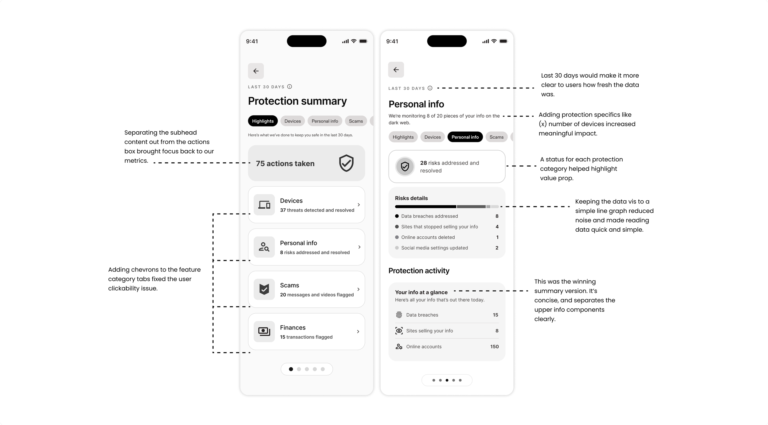
Improving wire-frames post research
After the research audit, I went back to the iterations and went screen by screen to finalize the layout. I focused on using a simple bar graph, consistent layout patterns, and a focus on highlighting action items.
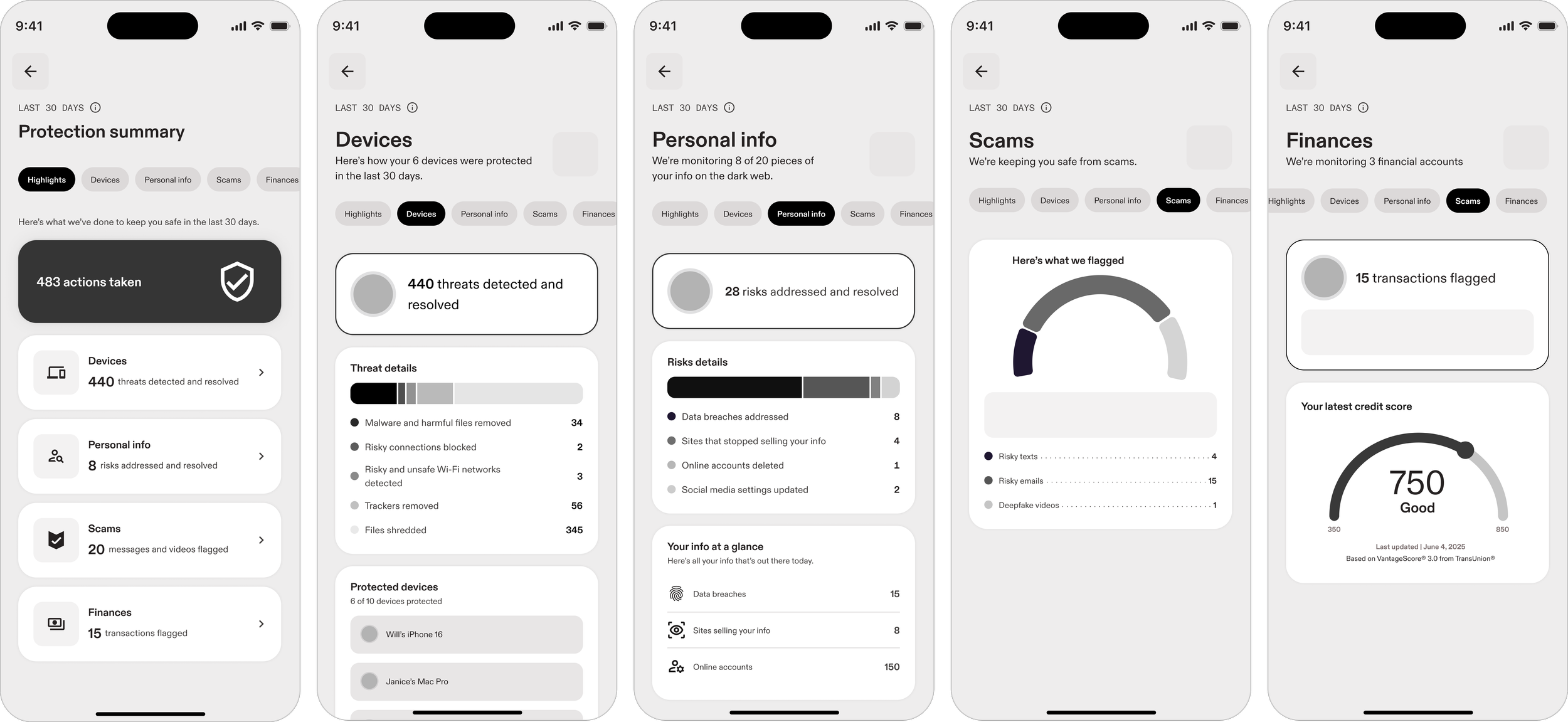
Limitations we had to work with
During the design process, it’s important to note our team encountered several limitations. Our timeline was accelerated by one week, our design system library was being redesigned, and enhancements would have to wait for post-MVP roadmap.
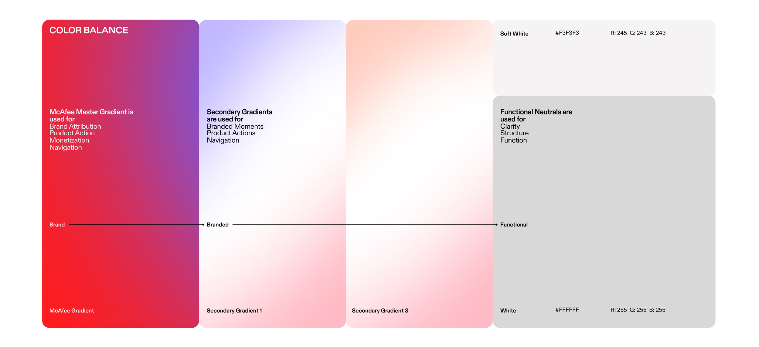
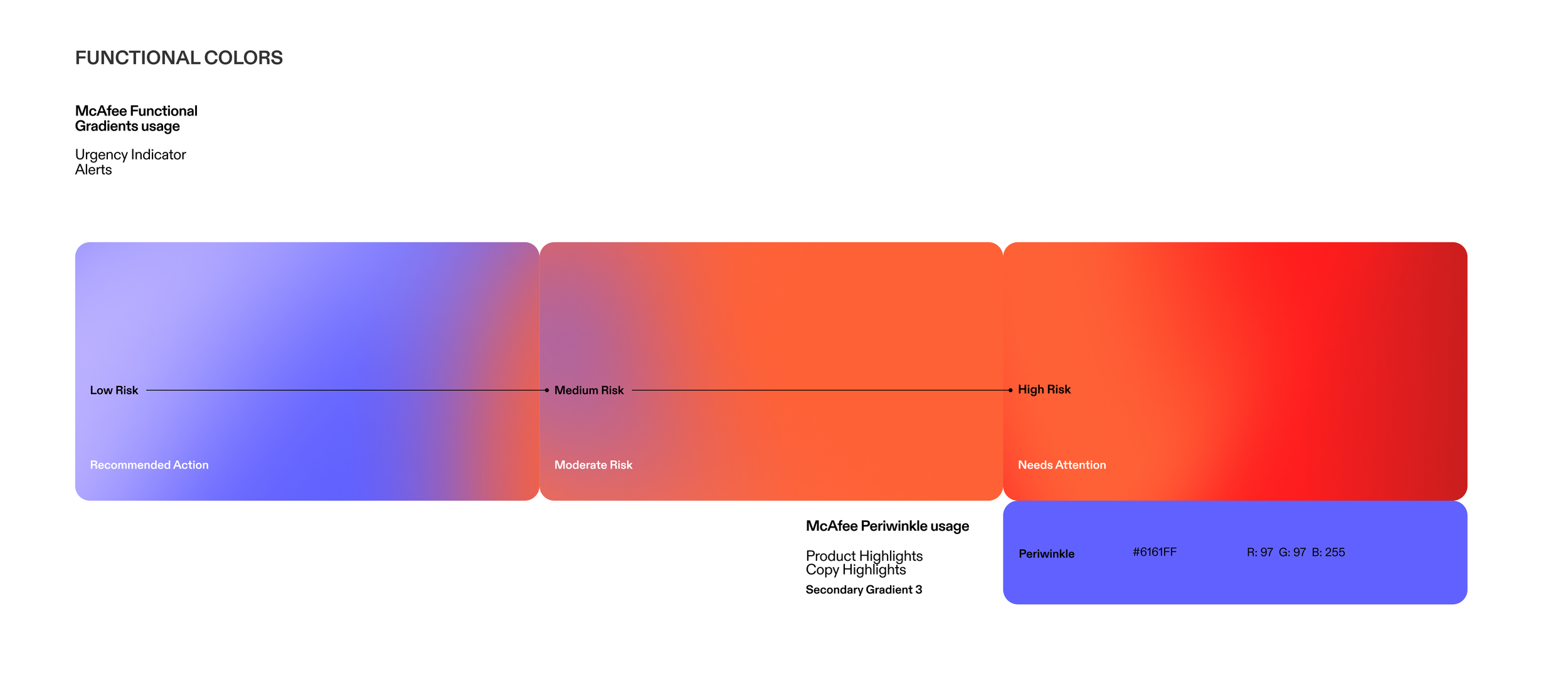
High fidelity mock-ups for the final delivery
With wireframes established and early insights integrated, I rapidly transitioned to high-fidelity production screens to accelerate our MVP launch. While we intentionally deferred pixel-perfect polish on edge cases, prioritizing speed-to-market allowed us to quickly ship to our core user cohort and validate the feature's core value proposition.
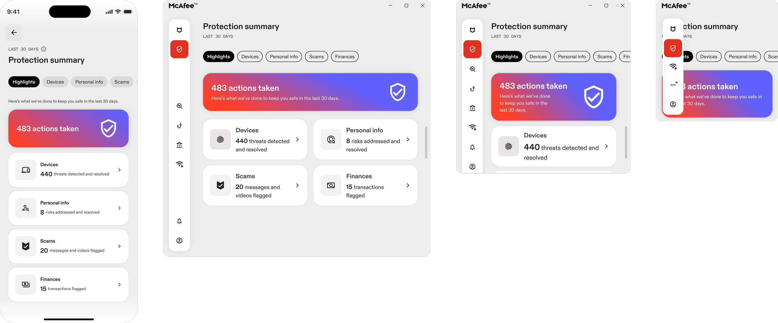
Making the experience cross platform responsive
Post-mobile launch, I led the responsive scaling of the Protection Summary for web and desktop. I worked on optimizing layout adaptability and refactoring mobile components into flexible, desktop-friendly navigation structures.
Roll out and impact
The Protection Summary unlocked a completely new value proposition: a highly personalized dashboard that updates on a rolling 30-day cycle. This dynamic content strategy successfully patched our critical funnel drop-off points, resulting in a measurable lift in overall feature enrollment and repeat active usage.
25% (up from 15% ) increase in DAU ratio
15% (up from 8%) increase in feature enrollment
90% of users surveyed gave satisfactory feedback
MAU increase of 2.5% which hit within our target goal range
Next steps
Following a successful initial mobile app summary release, we’re working on introducing advanced data metrics into upcoming product cycles, extending feature availability to free-trial segments, and design subscription frameworks for non-US geographic regions.