A homepage rebrand that increased user engagement rate
Protection at a Hand’s Reach
Revamping an outdated homepage to stop engagement drops and turn traffic into revenue. As lead designer, I spearheaded a complete UI facelift to fix our conversion leaks and modernize our first impression.
Let’s take a look at the process
My Role Lead Designer
Domain Security, Online Protection
Target audience Global Consumer, Desktop
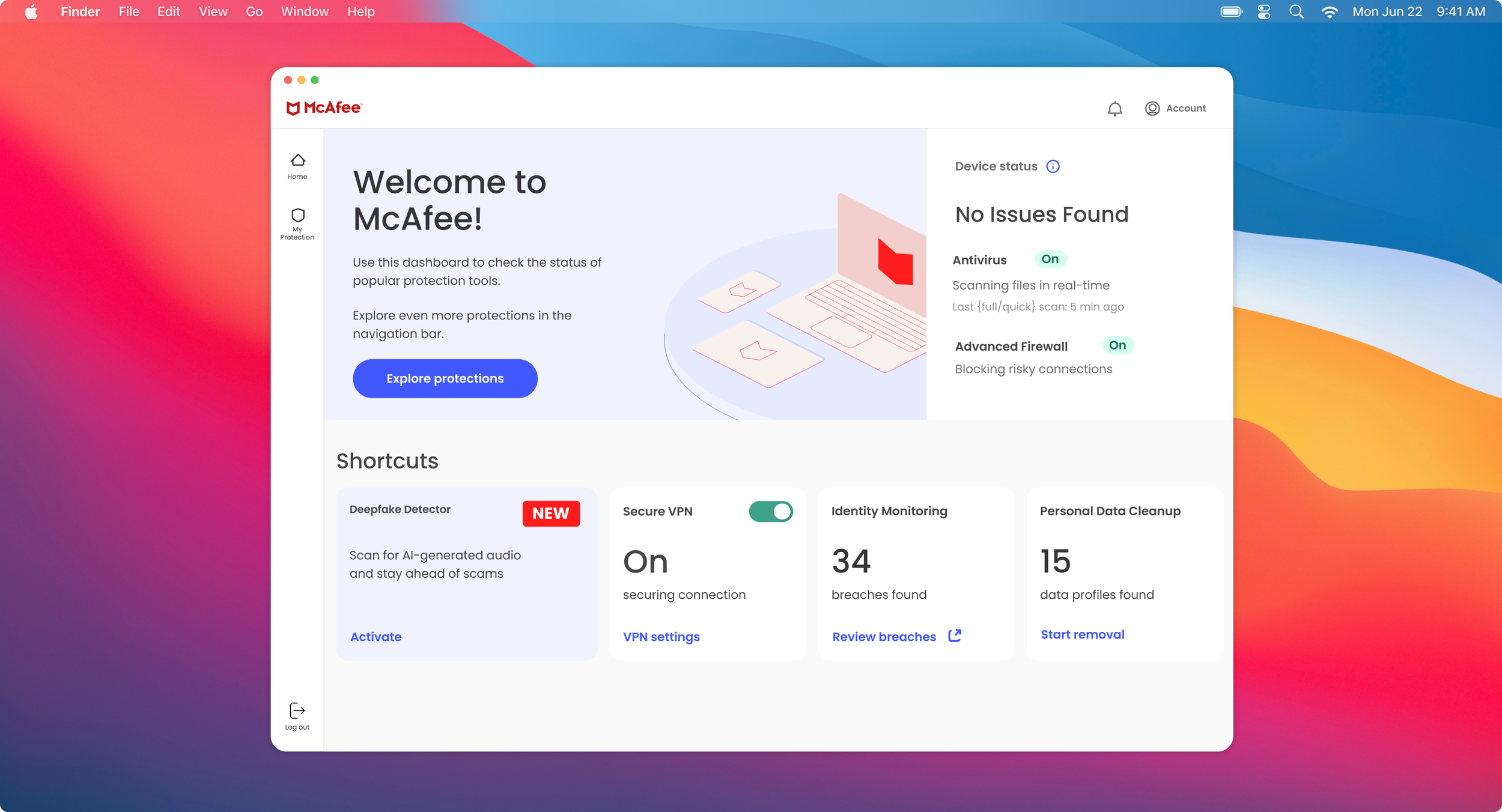
The homepage before the redesign
The initial homepage layout suffered from poor usability. Suboptimal color contrast degraded text legibility, weakened navigational cues, and stalled task completion rates.
The problem
Our analytics team flagged a decline in traffic and overall engagement on the homepage. Active user sessions plummeted by 25%, with many users opting out of interacting with our web product. We wanted to fix our homepage and offer a delightful experience to bring our users back.
Research insights that shaped the design
Together with the research team, I conducted a moderated usability study. With 27 existing users testing our homepage, we asked questions centered around site comprehension and task completion.
Our research revealed two major friction points: 78% of users didn't understand how the protection features worked, and 35% struggled to complete any feature enrollment process.
The challenge we had to accept
We balanced strict business goals with a user-first mindset. Meeting our metrics didn't mean compromising on UX—instead, we leveraged shortcuts and a new AI chatbot integration to make the homepage truly meaningful for our users.
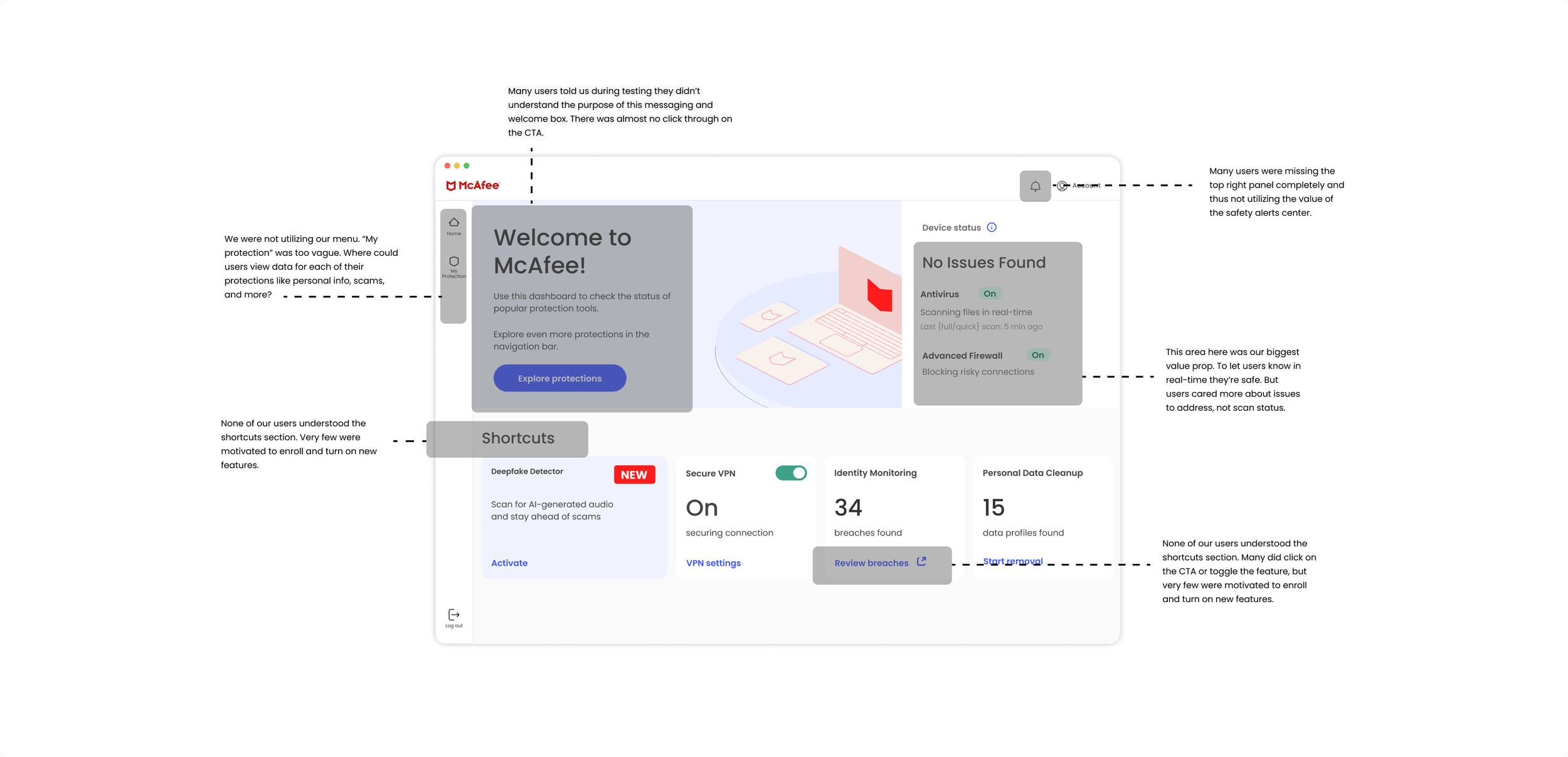
I conducted an audit of the homepage, locating paints points of friction and areas for improvement.
Wire-framing rough iterations and concepts
I created several concepts below. But using a standard card layout fell short of stakeholder expectations. Both the product team and our CTO pushed for a more disruptive, high-impact design, noting that our earlier homepage concepts were over engineered and lacked a clear "wow" factor.
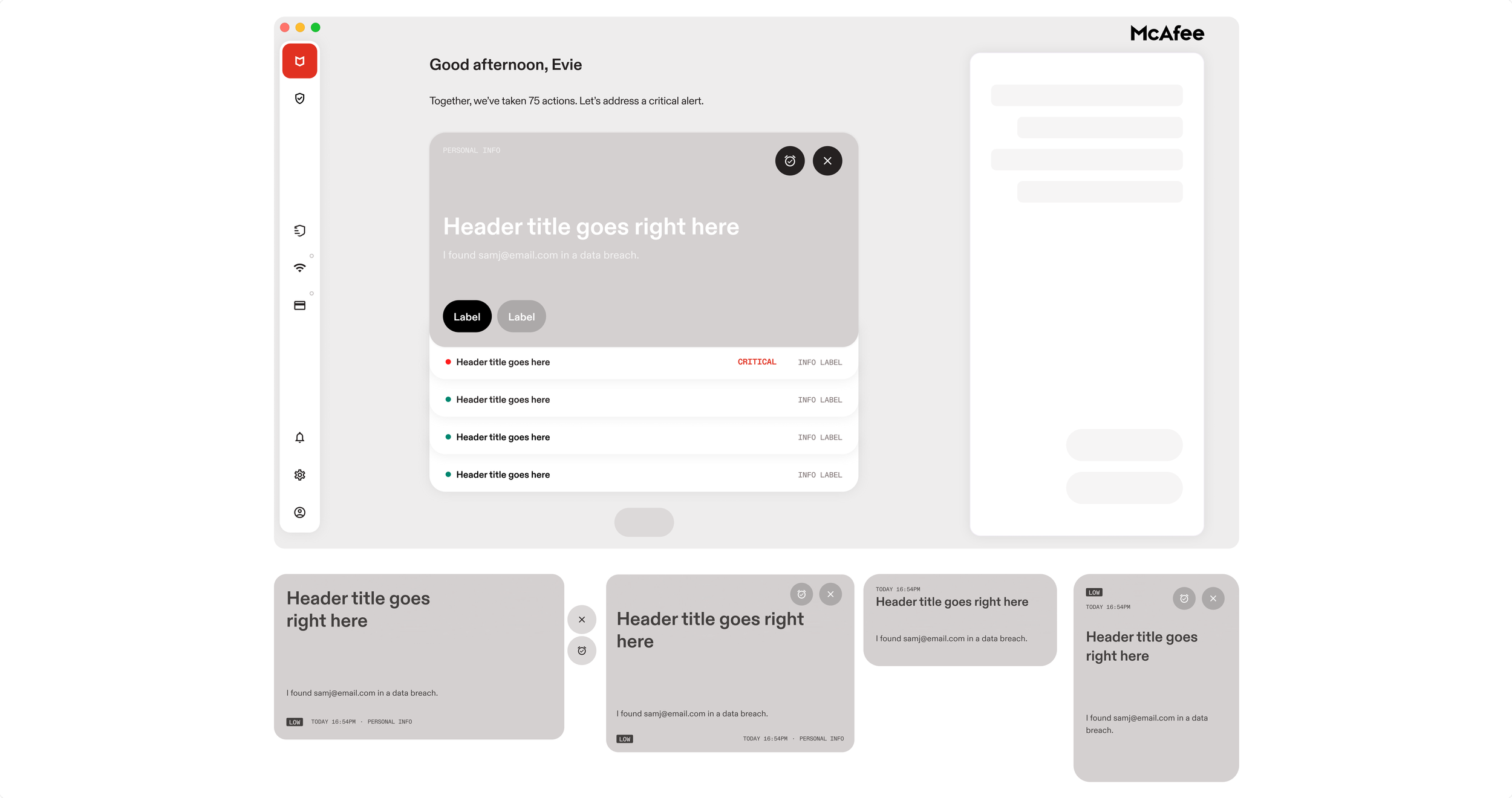
I dived into competitor research and found our answer: stacked cards. This sleek micro-interaction became the core of my design pattern, positioning our protection features front and center on the homepage and increasing click-through rate potential.
Here’s why the new design was better for our business and users
The new homepage was now structured and split into a 3 tier functionality: navigation, main alerts center, chatbot assistant. We utilized a simple UI layout to serve our users’ needs, and leveraged our AI to save users time on questions and finishing tasks. Making the homepage easier to use would also boost our engagement traffic.
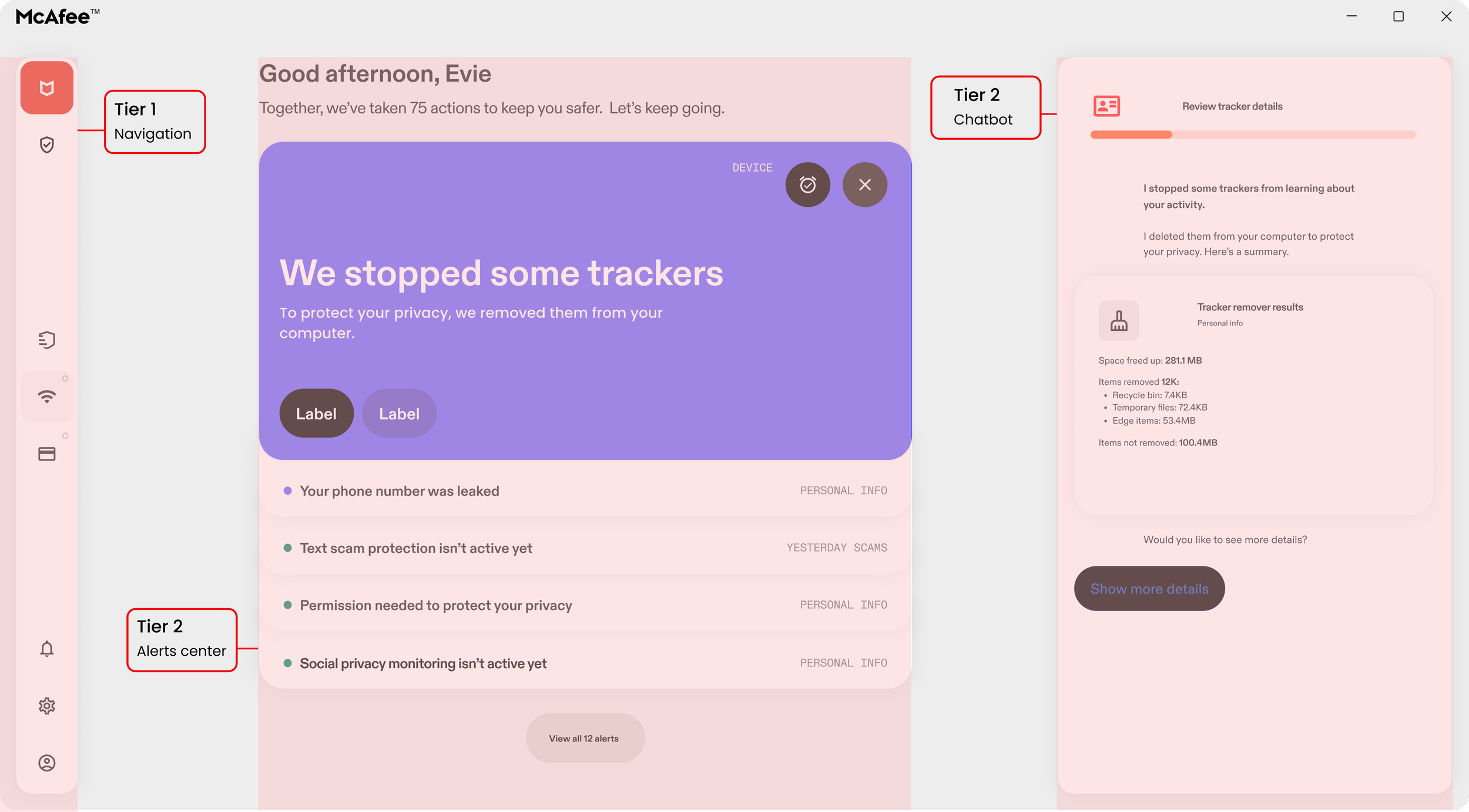
Creating the AI chatbot interface language
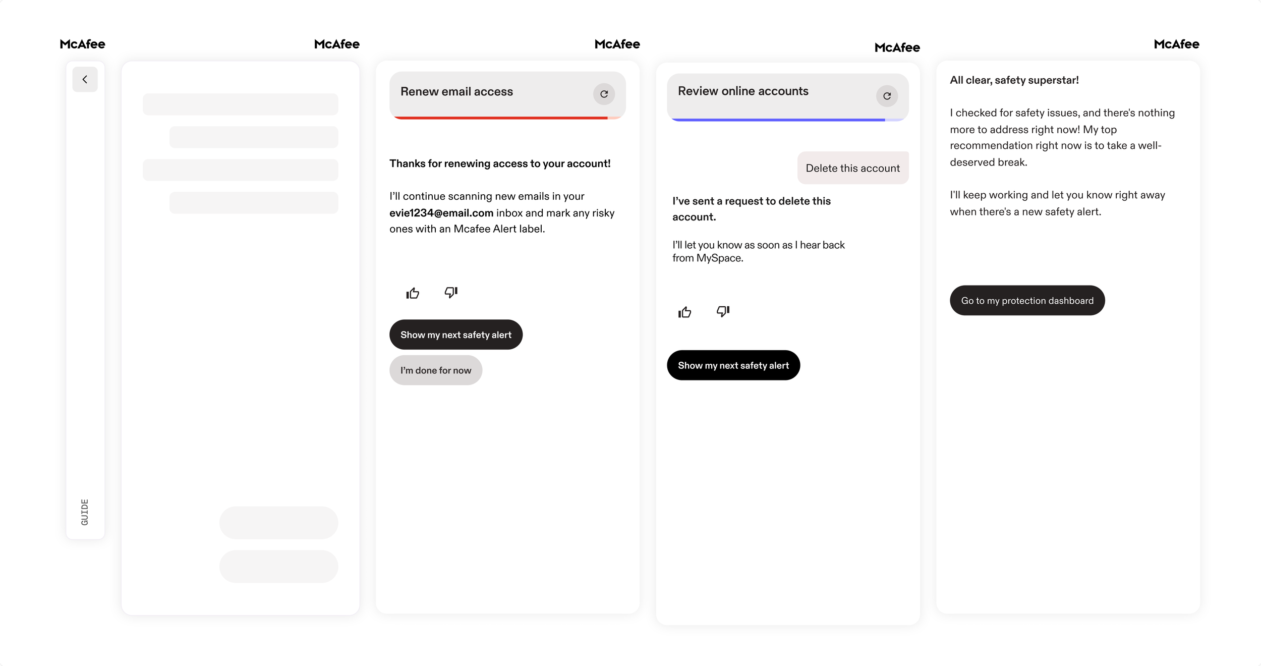
Alongside our content writers, we built a comprehensive prompt framework that dev team leveraged to train their LLMs. Below is an example of the live front facing interface chatbot UI concept. The chatbot would save users time on navigation, making it easier to search for tasks and mark them as done.
Putting it all into place
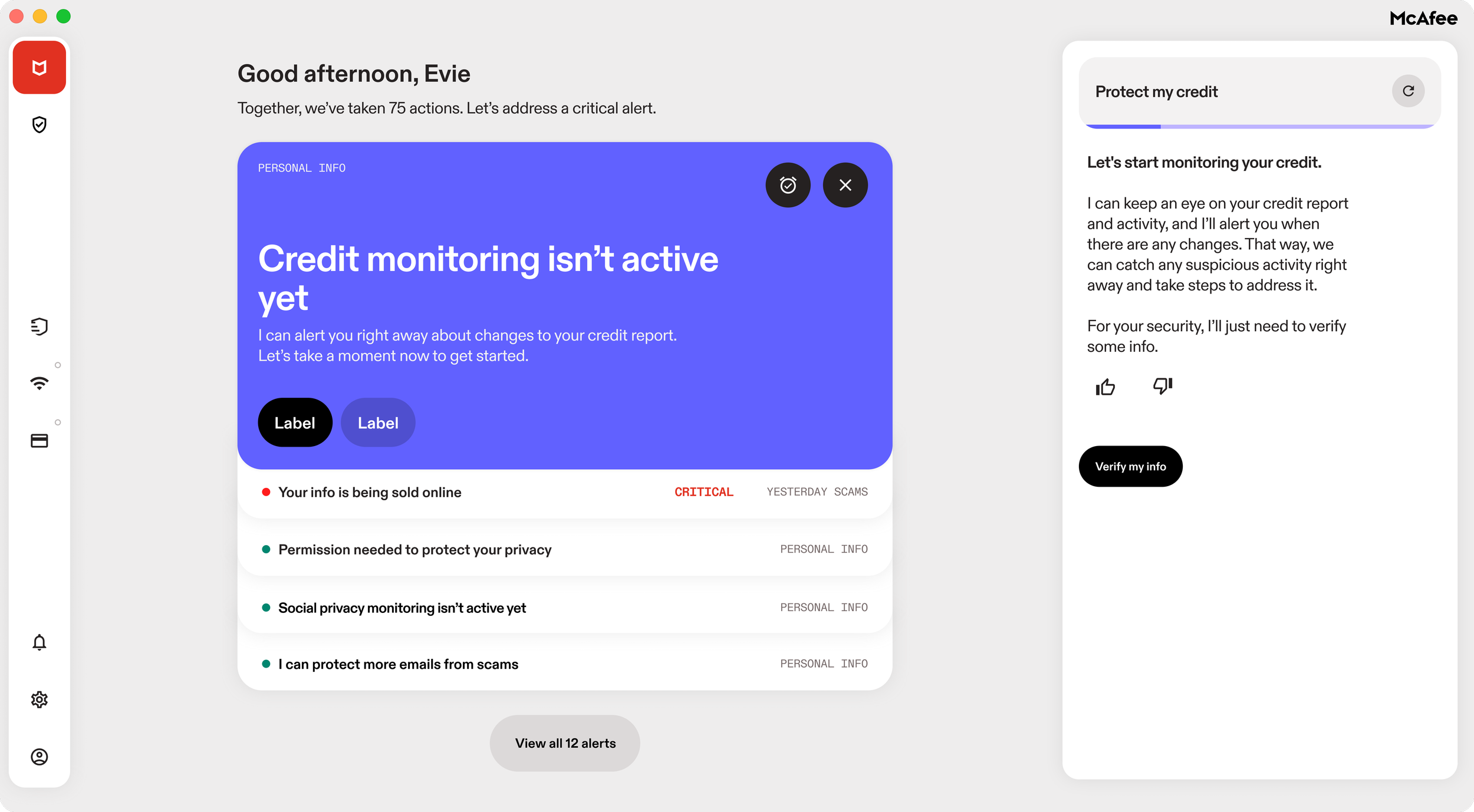
Once I had a homepage mapped out, it was time to place our features within the framework. With a stacked card design, we were able to alternate alerts and show previews of task items.
For accessibility we kept the UI simple. We chose three primary colors to communicate urgency, recommended actions, and a safe state.

Defining breakpoints for responsive design
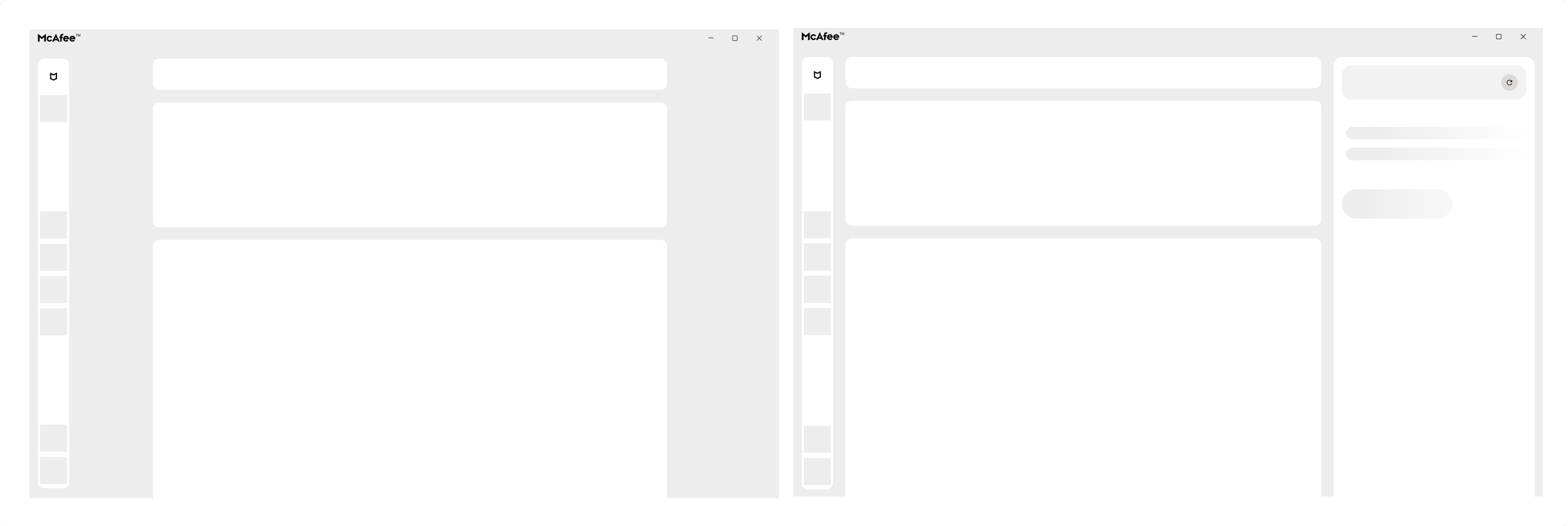
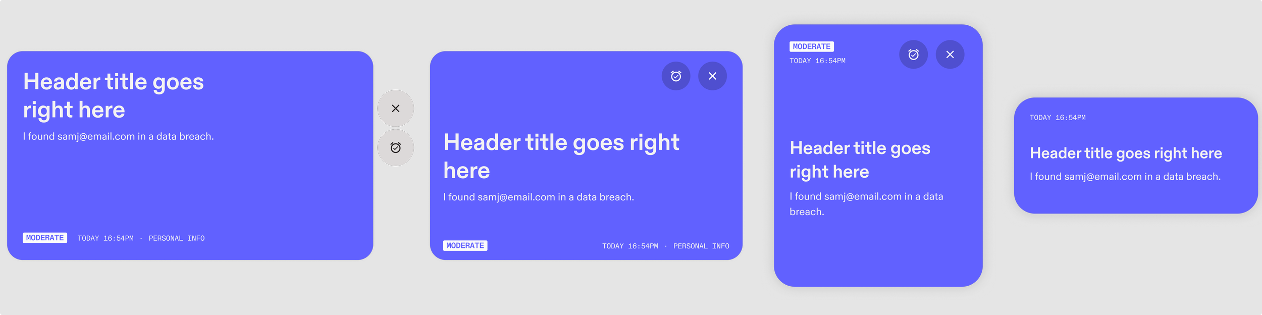
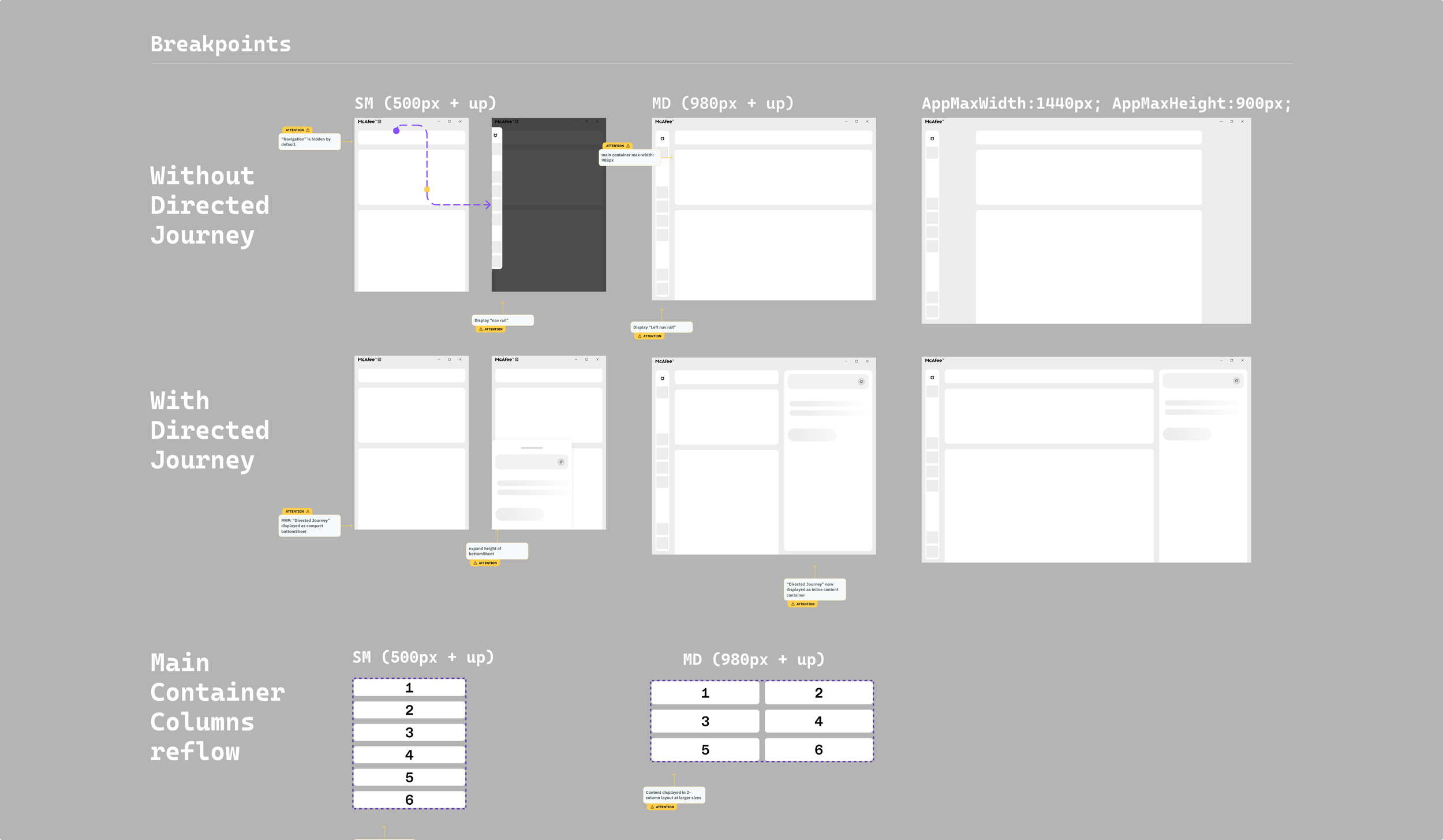
To optimize responsiveness, I defined adaptive breakpoints for the chatbot and main layout, ensuring consistent component placement and visual hierarchy across all viewports.
Roll out and impact
The new homepage redesign was a win for our business and for our users. We increased site traffic, boosted feature enrollment numbers, and got a fantastic customer satisfaction score.
40% (up from 25%) increase in site traffic growth and visits
87% of users interacted with out AI bot assistant at least once
95.4% users gave positive feedback of the new homepage from 33k total responses
Next steps post launch
Leveraging our early success in user engagement, our next priority is driving monetization growth by designing seamless upgrade triggers to transition premium users to our top subscription tier.
In addition, we’re already working on MVP validation. We will leverage initial usability insights to drive product enhancement loops and cross-functional QA cycles with engineering.